708
There is a few pieces of text in Street Fighter III : Third Strike that I find fascinating.
They aren’t important to the game. They are mostly semi-nonsensical pump up quotes. One bit of text might have a typo in it. None of that is why I find it fascinating. It’s the technique that I love.
In 1998-1999 lcd and plasma monitors existed, but they were not the type of thing you would, or even could, use in an arcade machine. They were expensive and were riddled with too many downsides. On the other hand, CRT displays were common and generally pretty high quality.
That meant that not only would the games be displayed on a pretty descent, commercial grade, CRT screen, but the developers would likely be working with a very similar CRT display right on their desks.
Developers could be fairly certain that the artwork they created would be exactly what their players saw.
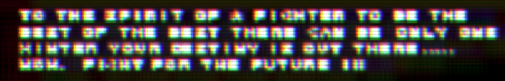
That’s the sort of convergence that lets you create this.

Tough to read, right? Well, kinda. It is legible, but only just. You can also see that they wrote ‘WINTER’ instead of ‘WINNER’. And that typo is even more funny when you consider that this is not at all how this text looked on the Third Strike screen.
Now that you had that warmup, try reading this list of locations.
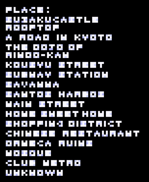
Now these images come from asset rips from the game, but I can’t actually guarantee you that the color values of these pixels are correct. They probably are pretty close though. But that does mean that what you are looking at here and what the developers and players of Third Strike saw are very different.

CRT phosphors are relatively chunky when compared to the RGB pixel grids of modern screens. They are also ridiculously bright. Like tiny colored light bulbs that flick on for just a small fraction of a second. That means that the shapes they describe soft, cloudy, glowing shapes, not sharp, defined pixels.
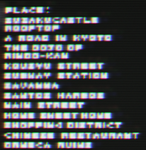
These particular sets of pixels end up being quite legible when they are pushed through the aperture grill of a particular type of CRT.
Unfortunately there is not really a good way to replicate this, or even to take a photo of a CRT screen. You can, but it won’t look the same as it does with your own eyes.
The best I can do is to simulate it with shaders, and even that won’t look quite right because it lacks the physical characteristics of a specific type of CRT monitor. Still, these might give you a tiny indication of what it would have looked like.
That each of these characters is composed of only 9 pixels and is still identifiable as real text is amazing, and it just proves that sometimes the tools and the art are so intertwined that they can’t really be taken separately.
If you happen upon a real Third Strike machine in the wild, give it a play. It’s important art, and deserves your attention and love.