456
This is a breakdown of my process on this painting so far.
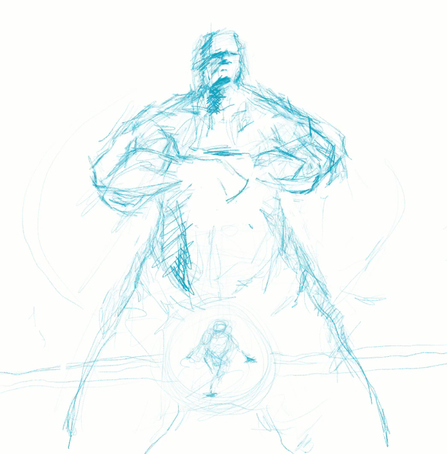
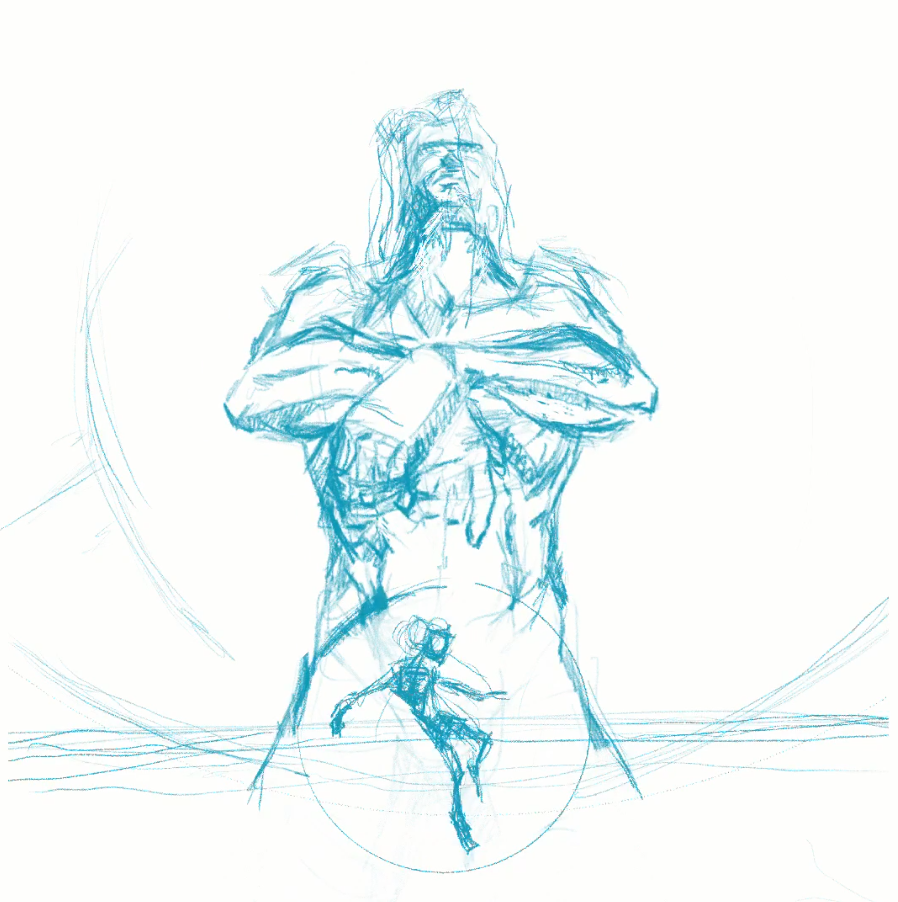
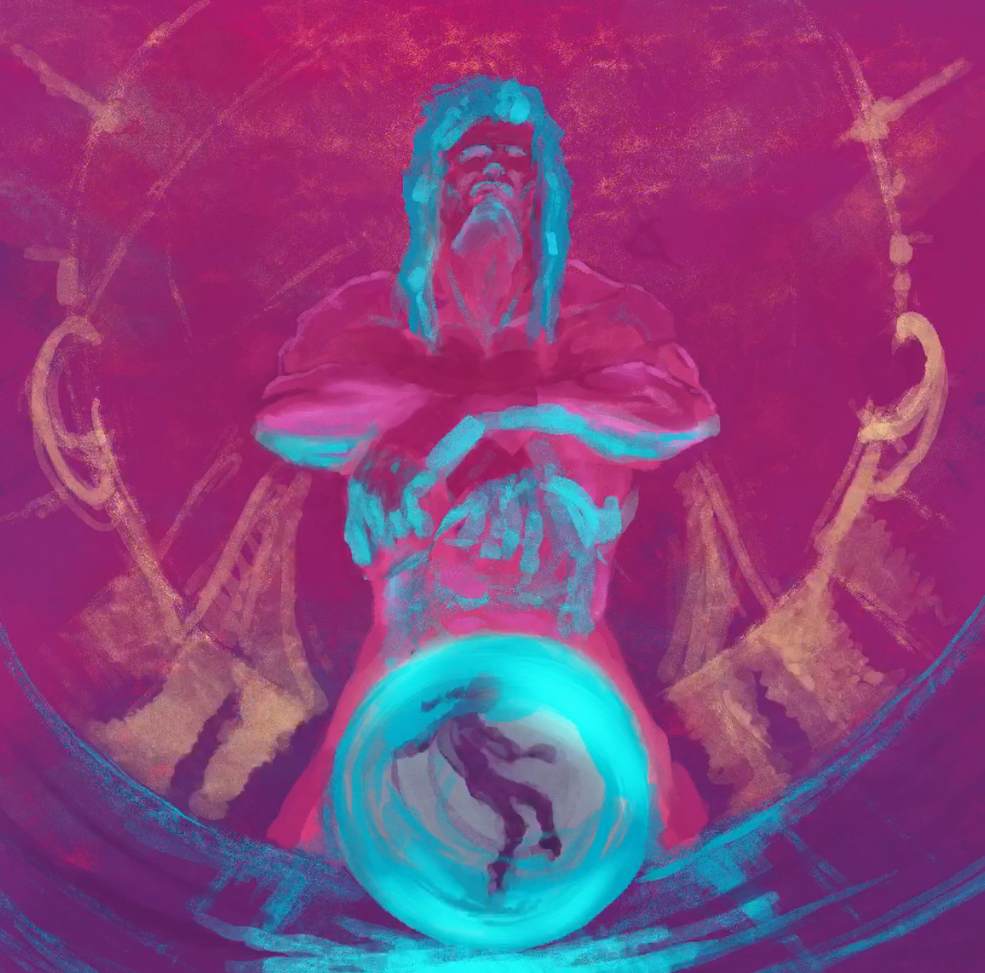
First I start with a sketch. I wanted to create a tall, inline composition for this one. Something that looked powerful and imposing, but with bright, rich colors.
First I start with a sketch. I wanted to create a tall, inline composition for this one. Something that looked powerful and imposing, but with bright, rich colors.

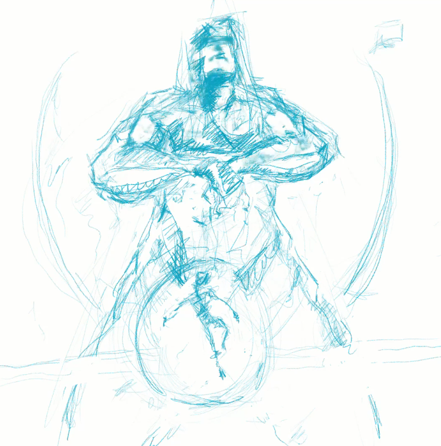
I didn't really like the feature characters head position so I adjusted it from a downward stare, to a more imperious looking chin lift. I also made the foreground figure larger with a more reclined or off balance pose.

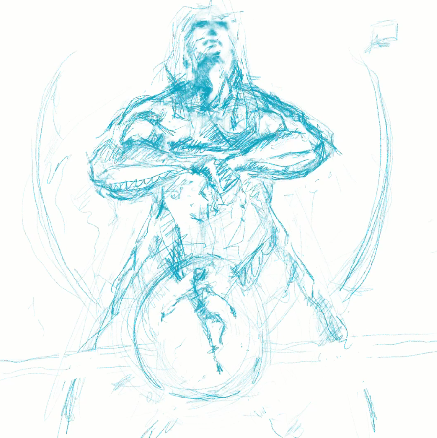
The basic composition was working for me, but the perspective of the feature character was sort of all over the place. I searched around for some better reference but didn't find anything that suited my needs. Remembering that I am a 3D artist, I posed a simple 3D character and set up a low angle camera. That image, along with the figure reference that I gathered (I literally just googled stuff like 'wrestler low angle' and 'athlete leaning')

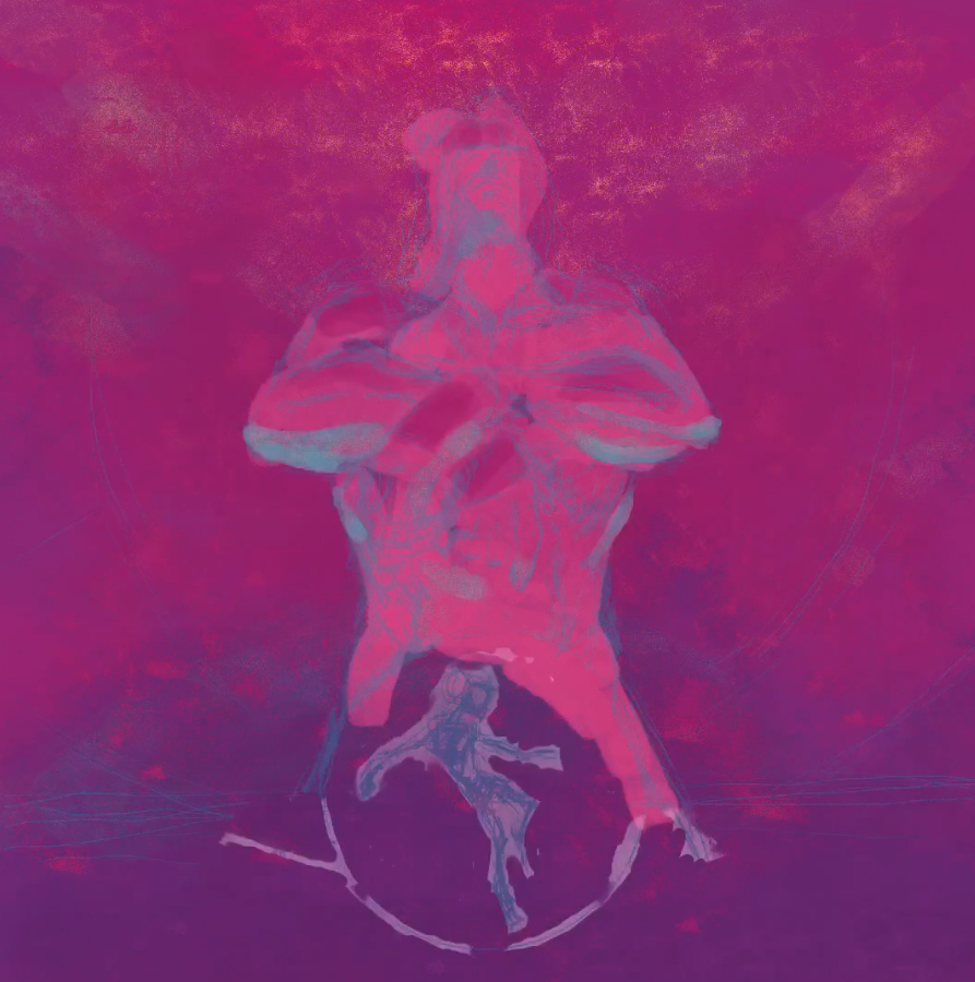
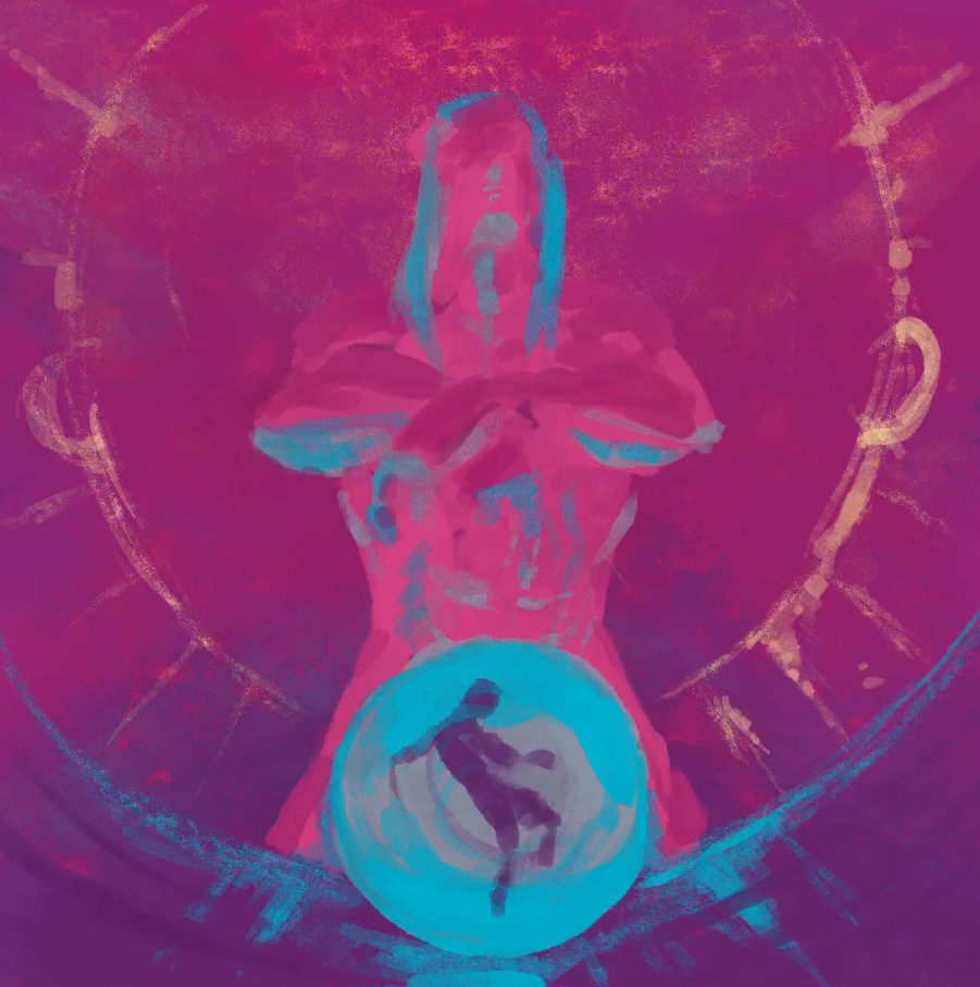
Then it's on to colors. I picked a palette that I thought might be directly counter to the image. If the characters are about being powerful and imposing, the colors are the opposite of that. Pink and blue that strays into the pastel and neon.

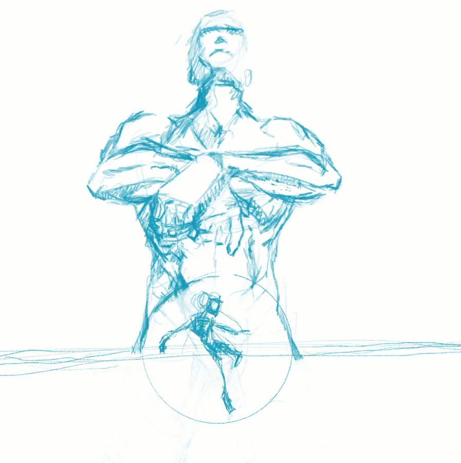
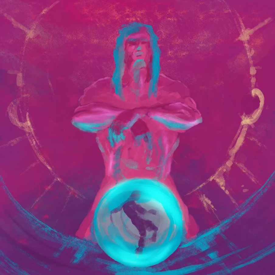
And now it's time to refine the features, sculpt the characters with highlights and shadows and just generally start finishing the damn thing.

When I have it all wrapped up I'll post the final image. bit more to go.

This post is licensed under CC BY 4.0 by the author.