023
I don’t think that writers block (or artists / designers / creators block) is a fear of the blank page or canvas. I think a creator gets “blocked” because they haven’t adequately defined the problem they are trying to solve.
I’m sure that not everyone thinks, or works like this. I’m sure that some people prefer to intuit creative expression, but my brain just doesn’t work like that. Art needs to be equal parts feeling and mechanics for me to create something successful. It’s probably why I gravitate to design work that has a large technical component to it. Like games.
Here is a quick breakdown of how I went about defining one particular design problem.
When I first started on this game I had almost no idea what it would look like. It just didn’t seem important. The mechanics of how you would move items around the screen was a more interesting and immediate problem. Games, even experiential art games like Proteus, are more about mechanics than design. Proteus is about navigating, and poking at, an environment. The aesthetics could have gone off in pretty much any direction, but movement and exploration are the core of that design. Establish that core and you have taken a step toward defining your design problem.
 |  |
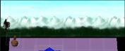
In our case, we have a game that is played from a typical puzzle game perspective. The camera is locked in one position and adding too much perspective, or changing perspective, will just make the game more difficult to play. So there is another step toward defining the design problem.
 |  |
We wanted some representation of progress in the game, how far have you gone in a level or challenge, and how far away is the next challenge. There is already a game vocabulary for that. It is sometimes described as “move right and conquer”. The player character typically starts on the left side of the screen and either moves to the right of the screen, or just continuously moves right as the world moves past them heading left. As a visual shorthand for progress this construct works very well, and it is easy for non-gamers to pick up, so that further defines the design of the game.
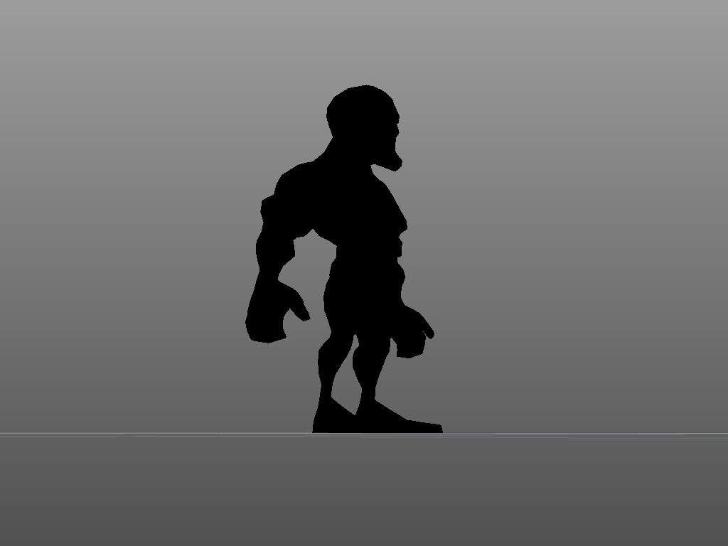
The most important elements of the game should take up the majority of the screen space. Our game is also being simultaneously designed for pc and mobile devices, so the physical limitation of touch devices has to come into play. Elements that can be touched need to be a certain size or they just won’t work. This pushes the progress area up into a small portion of the screen. The hero character and the enemies will need to fit in this small area, so that means that fine details in the character textures just won’t be visible. Large, high contrast details on the characters becomes a requirement. While trying to develop a presentation that meets these requirements, but is still visually interesting, I realized that there were still a lot of directions I could go in. I made a few false starts and tried out some ideas that just didn’t work out, because I still had not really defined the problem.
At first I tried creating detailed 3D models, thinking that we might use them in long shots and closeups. Closeups didn’t really feel like they would help the game at all, so we could do away with those. Then I thought that flat, cut out style design would give us the contrast we needed. They would, but the character animation would be very limited. I settled on low to medium detail 3D models with high contrast, monochromatic textures. While the surface details of small objects wouldn’t be visible, animation can read well at a very small scale, so having a character that was easy to animate was still very important.
 |  |
 |  |
Memory limitations are always a consideration on mobile platforms. One of the benefits of going with monochromatic textures is that they are highly compressible. Also, since a typical image file is actually made up of 3 (4 if you count the alpha channel) monochromatic channels that are combined into a single colour image, we can pack 3 times as much information into the same amount of memory space.
As I further and further define the problem, or problems I’m trying to solve with this design, the easier and more obvious the solutions get. Now it could be possible that I need to go back and rethink the problem, or solve it in a different way. I could get partway into a design solution, only to find I’m not really solving the problem at all. As long as I keep narrowing in on the problem, further defining and refining it, each blank page is just one in a long line of blank pages that are filled, and then abandoned. Each one is just another opportunity to solve a problem.
And here is a video of me painting a texture in Sculptris.